One thing I discovered was that the toolbar with the shortcuts (F1, F2, ...) is a bad habit to use. Most users never find out how the software is structured because of this. I want people to develop from beginners to advanced users without getting boring. So I removed the toolbar in the new version, leaving the user with a drop down list and shortcuts.
The general idea is to let the user with two choices:
1. Select the appropriate tool from a list box
2. Use shortcuts
No colored toolbar that make bad habits.
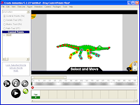
Here's a screenshot of new interface of Stickman:
(the version number is not changed yet, the new version will be 5.3)

The interface does not look very fancy, but it's cleaner and I love it. It looks more like the old interface of Stickman 4, but I think new users will learn quicker.

Ingen kommentarer:
Legg inn en kommentar