This is a try to combine frame-by-frame with cutout animation.
I used a switch node for each back leg on the puppy.
lørdag 27. september 2008
fredag 26. september 2008
Stickman Time Line
torsdag 25. september 2008
onsdag 24. september 2008
Traditional vs Cutout Animation
I have loved Disney movies since I was a kid, especially 'The Lion King'.
It looks so living without being real.
But how much work is it to create it?
Let's say, one person can animate 3 seconds of smooth 24 frames per second every week. To create 5 minutes, you need to work almost 2 years! Yikes!
Cutout is a technique to reduce work in the animation process. Instead of drawing every frame, the pieces are moved from frame to frame or animated with key frames like in Stickman. It's limited but effective.
Many of software packages try to bridge the gap between traditional and cutout animation. They hope to get the best out of both worlds. Stickman is very untraditional. For example, the 'Create Figure' editor (good old Elemento) are more like a programming tool than a graphics designer.
Programming is a way of controlling the relationship or logic between elements. In 'Create Figure' you can add skeleton and program attributes with expressions. It's exciting to see how a sketch drawing becomes a figure.
So, with programming, it is possible to fake some of the effects created with traditional animation. For example, squeeze & stretch, eye control and skeleton. I don't say cutout animation is better than traditional animation, but it is more effective. Cutout and traditional need to be considered as two different and separate genrees of animation.
If you work with traditional animation, your time and your skills is your limit. In cutout, you don't need drawing skills that much, but storyboard planning is more important.
Storyboard is like a comic strip of your movie. It helps the animator and director to cooperate. One scene can be very easy or very hard to animate, depending on how it is planned in the storyboard. The important thing is that the director and animator agree about how the movie will look at the end.
tirsdag 23. september 2008
Gida
I want to create a funny, simple character that looks like taken a child drawing.
I've named it 'Gida'.
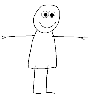
For the head and boy, I created a curve element. I used the 'freehand' mode to draw the shape. For the legs and arms, I used opencurve.
I used 'deform' nodes for the arms and legs.
No bones except for the head. That makes it more difficult to animate, but gives more control for stretch and squeeze.
Here are the control points:
I've named it 'Gida'.

For the head and boy, I created a curve element. I used the 'freehand' mode to draw the shape. For the legs and arms, I used opencurve.
I used 'deform' nodes for the arms and legs.
No bones except for the head. That makes it more difficult to animate, but gives more control for stretch and squeeze.
Here are the control points:
mandag 22. september 2008
Animate a Thinking Character
This article will tell you the secrets of good animation.
Good animation have more common with theatre than drawing or painting.
It depends mostly on how the character acts.
Take a look at these two pictures:
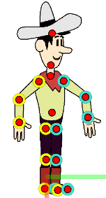
Can you tell me what the cowboy is doing in the first picture?
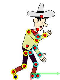
Can you tell me what the cowboy is doing in the second picture?
I can't tell you what the cowboy is supposed to do in the first picture. It just looks unnatural.
In the second picture, it's clear that the cowboy is tired (or sneezing). Maybe he's going to bed.
This is the difference between a thinking character and a controlled robot. Your job as an animator is the create the illusion of live. Make the character behave like it's thinking and acting on it's own.
The goal of animation is to make the publicum forget that what they are watching is animated.
Good animation have more common with theatre than drawing or painting.
It depends mostly on how the character acts.
Take a look at these two pictures:


Can you tell me what the cowboy is doing in the first picture?
Can you tell me what the cowboy is doing in the second picture?
I can't tell you what the cowboy is supposed to do in the first picture. It just looks unnatural.
In the second picture, it's clear that the cowboy is tired (or sneezing). Maybe he's going to bed.
This is the difference between a thinking character and a controlled robot. Your job as an animator is the create the illusion of live. Make the character behave like it's thinking and acting on it's own.
The goal of animation is to make the publicum forget that what they are watching is animated.
søndag 21. september 2008
Turn Wheel
Yeat another frame-by-frame drawed animation.
This was for testing semi-transparent black pixels copied from Photoshop.
For some reason, Windows does not copy semi-transparent pixels to the clipboard (or is it Adobe Photoshop's fault?). Therefore, I created a new algorithm that filters out non-grayscale colors and sets the alpha by blackness value.

lørdag 20. september 2008
New Design
fredag 19. september 2008
Create Animated GIF
Here are some gif animations I've created with the upcoming Stickman 5.3.


Stickman 5.3 will include two new function:
1. Paste Drawing From Clipboard (removes the background color).
2. GIF export in CA (Create Animation).
This is how I did it:
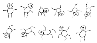
1. Draw the frames in MS Paint:

2. Open Stickman. Select 'New Figure'.
3. In MS Paint, select a frame and use Ctrl+C to copy to clipboard.
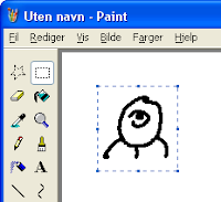
4. In Stickman CF (Create Figure), goto Edit->Paste Drawing From Clipboard.
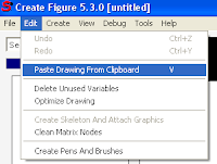
5. Repeat step 3-4 for every frame.
6. In Stickman CF (Create Figure), goto Create->Control->Switch.
7. Put all images inside the switch.
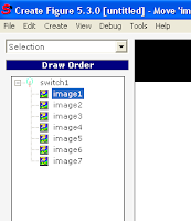
8. Select 'Placement' and resize the figure so it fills the screen.
9. Save the figure and add it to Stickman CA (Create Animation).
10. Use the switch tool to flip the images. Create a key frame for each 5th frame.
11. Render as GIF Animation with 5 frames per second and resolution 64x64.


Stickman 5.3 will include two new function:
1. Paste Drawing From Clipboard (removes the background color).
2. GIF export in CA (Create Animation).
This is how I did it:
1. Draw the frames in MS Paint:

2. Open Stickman. Select 'New Figure'.
3. In MS Paint, select a frame and use Ctrl+C to copy to clipboard.

4. In Stickman CF (Create Figure), goto Edit->Paste Drawing From Clipboard.

5. Repeat step 3-4 for every frame.
6. In Stickman CF (Create Figure), goto Create->Control->Switch.
7. Put all images inside the switch.

8. Select 'Placement' and resize the figure so it fills the screen.
9. Save the figure and add it to Stickman CA (Create Animation).
10. Use the switch tool to flip the images. Create a key frame for each 5th frame.
11. Render as GIF Animation with 5 frames per second and resolution 64x64.
torsdag 18. september 2008
onsdag 17. september 2008
Time Delay Fixed
The new version of Stickman (5.3) will be much faster to receive news or to browse the online library. Users that had problems with time delay between the server in Norway and their location will get a better experience.
The problem was to detect the length of the data stream received over HTTP. Before, the length was unknown. Therefore Stickman had to wait some time before disconnecting the data stream. I found a method to read the data stream length. Now the data stream is closed immediately at the end. This means better speed.
The problem was to detect the length of the data stream received over HTTP. Before, the length was unknown. Therefore Stickman had to wait some time before disconnecting the data stream. I found a method to read the data stream length. Now the data stream is closed immediately at the end. This means better speed.
mandag 15. september 2008
Name Changes
Stickman & Elemento is now becoming 'Stickman'. The reason of this name change is that Stickman & Elemento are no longer two programs, but two different tools in the same program. Perhaps some customers are confused when they order, wondering if Elemento comes with Stickman, or if they need to order Elemento too.
Stickman & Elemento -> Stickman
Stickman -> Create Animation (CA)
Elemento -> Create Figure (CF)
The figure file format will still be elemento.
Stickman & Elemento -> Stickman
Stickman -> Create Animation (CA)
Elemento -> Create Figure (CF)
The figure file format will still be elemento.
søndag 14. september 2008
So Much Rewriting of Code!
I decided to change something that hasn't changed since Stickman 1.0. That's three years ago! What I wanted to do: Let the user choose tool action by right-clicking in the work area.
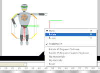
The problem was that, for example in matrix tool, the right+drag was used to rotate. So I had to rewrite all tools to use the new standard. From now on, the user will only use the left mouse button in a tool. Notice the icons on the left side of work area are removed and put into the right-click menu.
Another new feature is snapping. Snapping is turned on by default, you can turn it off by right-click and uncheck 'Snapping On'.
fredag 12. september 2008
New Stuff Coming Up
I've been working on the next version of Stickman for a while. There will be some big changes and many small ones.
One thing I discovered was that the toolbar with the shortcuts (F1, F2, ...) is a bad habit to use. Most users never find out how the software is structured because of this. I want people to develop from beginners to advanced users without getting boring. So I removed the toolbar in the new version, leaving the user with a drop down list and shortcuts.
The general idea is to let the user with two choices:
1. Select the appropriate tool from a list box
2. Use shortcuts
No colored toolbar that make bad habits.
Here's a screenshot of new interface of Stickman:
(the version number is not changed yet, the new version will be 5.3)
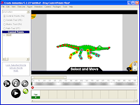
The interface does not look very fancy, but it's cleaner and I love it. It looks more like the old interface of Stickman 4, but I think new users will learn quicker.
One thing I discovered was that the toolbar with the shortcuts (F1, F2, ...) is a bad habit to use. Most users never find out how the software is structured because of this. I want people to develop from beginners to advanced users without getting boring. So I removed the toolbar in the new version, leaving the user with a drop down list and shortcuts.
The general idea is to let the user with two choices:
1. Select the appropriate tool from a list box
2. Use shortcuts
No colored toolbar that make bad habits.
Here's a screenshot of new interface of Stickman:
(the version number is not changed yet, the new version will be 5.3)

The interface does not look very fancy, but it's cleaner and I love it. It looks more like the old interface of Stickman 4, but I think new users will learn quicker.
Abonner på:
Kommentarer (Atom)


